In this session we again discussed Reid Miles album covers. We had to explore the basic methods he uses in his designs. In his work you can find fundamental principles which repeat in a lot of his designs. For example using coloured letters as well as a range of different typefaces. With the different type faces he would alter and mutate them to take on their own identity, often overlapping them or enlarging them to take up more space. In his style he typically uses small pictures that take up a small amount of space or incorporated them in to one of the larger letters or shapes. Another part of his identity is adding an effect to the pictures on the album covers. He would often take the pictures himself or use the work of Francis Wolff. Apart from the effect he would often play around with the perspective of the picture for added effect. Although there are many colours and effect within the design, the actual background is almost always a plain colour, something neutral as not to take away from the design itself but to compliment what he has already done.
In this session we had to try and replicate his style and the techniques he used:
 |
| Home practise on making Reid Miles inspired CD Covers. Here i tried to accent the typeface, overlapping the letter. The pictures and text were chosen at random. I edited the picture in photoshop in the style of Reid Miles. To achieve this effect I chose a bold typeface which is too big for the album and overlapped the letters. I have changed the kerning and the tracking of the letters. |
 |
| This is the 1st finished design. |
 |
| I changed the placement of the text to give the design more balance, so this is the final finished design.I would change some things like the text as it could be more readable, but this was my first attempt. |
 |
| This was the inspiration for my design. |
 |
| This is another take on one his design. I tried to replicate the use of pictures in shapes. I decided to use triangles instead of stripes. |
 |
This is the finished design
This was the inspiration for my second design
 |
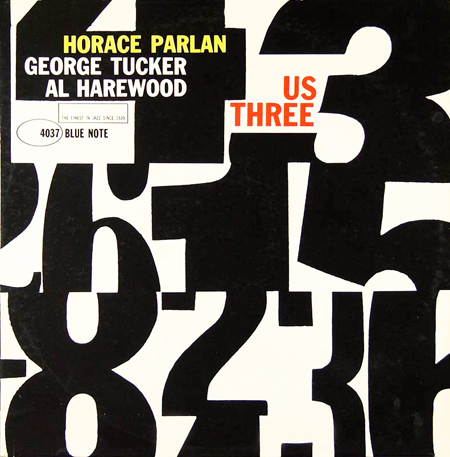
In this design I decided to use numbers instead of letters. I created the numbers in illustrator using different typefaces. I used the pathfinder tool to cut them in the way that I needed. After i sent the file to indesign and finished the design with random names.
This is the finished design. In this design I would have liked to change the position of ''Us Three''.
 |
| First I built the Numbers in Illustrator |
This is the original that inspired my design.


No comments:
Post a Comment